
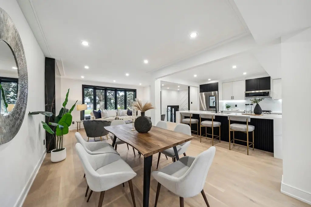
Start with the fixed finishes
Flooring, cabinets, counters, tile and wall colour already establish the visual temperature of a room. Furniture and accessories should work with those finishes instead of introducing an unrelated palette.
Warm woods often benefit from soft cream, stone and muted earthy accents. Cooler finishes can be balanced with textured neutrals, black details or restrained blue and green tones.
Use contrast to improve photographs
A room with no contrast can look flat online, while too many strong colours make the space feel busy. Dark frames, a defined rug, layered cushions or one piece of artwork can create enough visual structure without dominating the listing.
- Repeat an accent colour two or three times rather than once.
- Keep large upholstered pieces quieter than small accessories.
- Check the palette through a phone camera before photography day.
Colour should connect the home
Adjacent rooms do not need identical colours, but they should feel related. Repeating a material, undertone or accent creates continuity as buyers move through the property.
Professional staging uses colour as one part of the full plan, together with layout, scale, light and the likely buyer for the listing.